Campaign Site
Wireframe
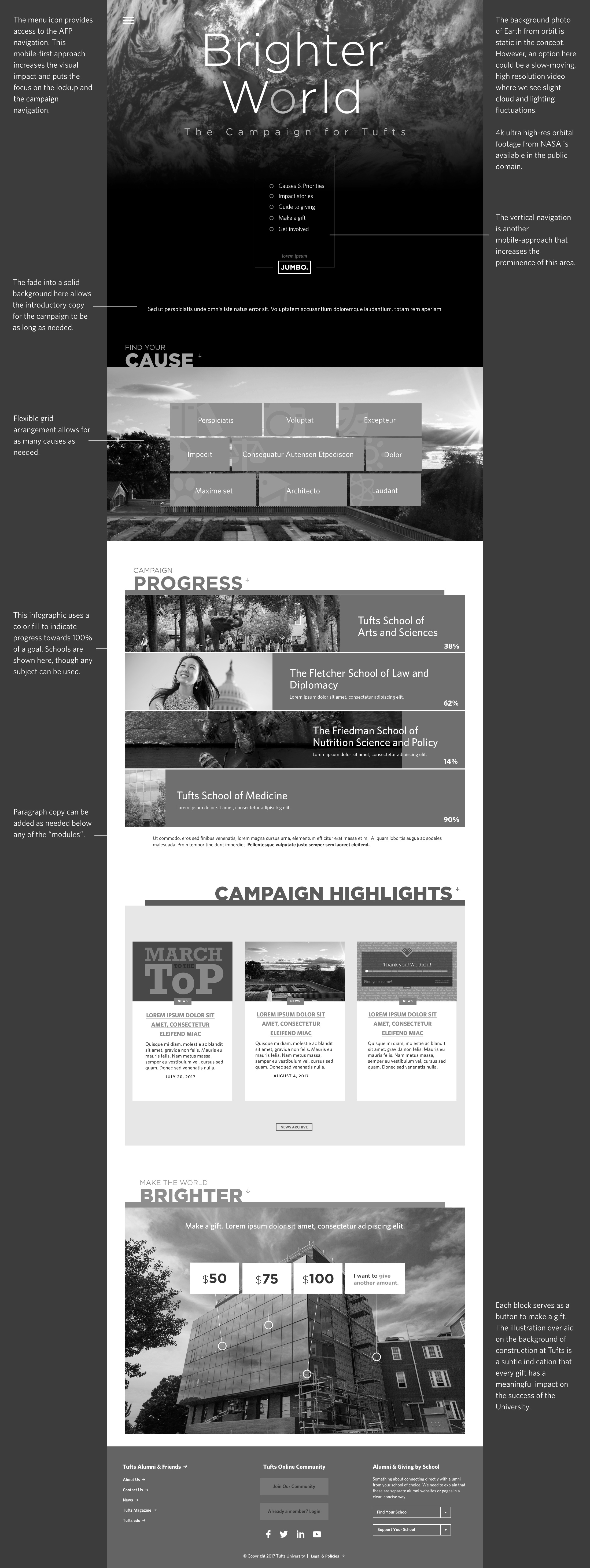
Initial wireframes were the result of several meetings with stakeholders that established a need for strong visuals, a request to include video in a hero, and taking a "mobile-first" approach. The site's core function was to inform users of several focus areas important to the campaign, to promote giving, and to showcase new campus construction. A challenge was how to integrate the focus areas when at different phases of the project the strategy shifted from showing them equally, to nesting them in broader categories or other taxonomy changes that made it difficult to show hierarchy without creating too much information for the user to easily grasp.
Although everyone loved the idea of powerful video in the background, it was difficult to find Tufts-related footage that worked well visually without giving stakeholders the perception that one area of the university was being favored over another. We also went through a series of different names for the campaign.
visual design
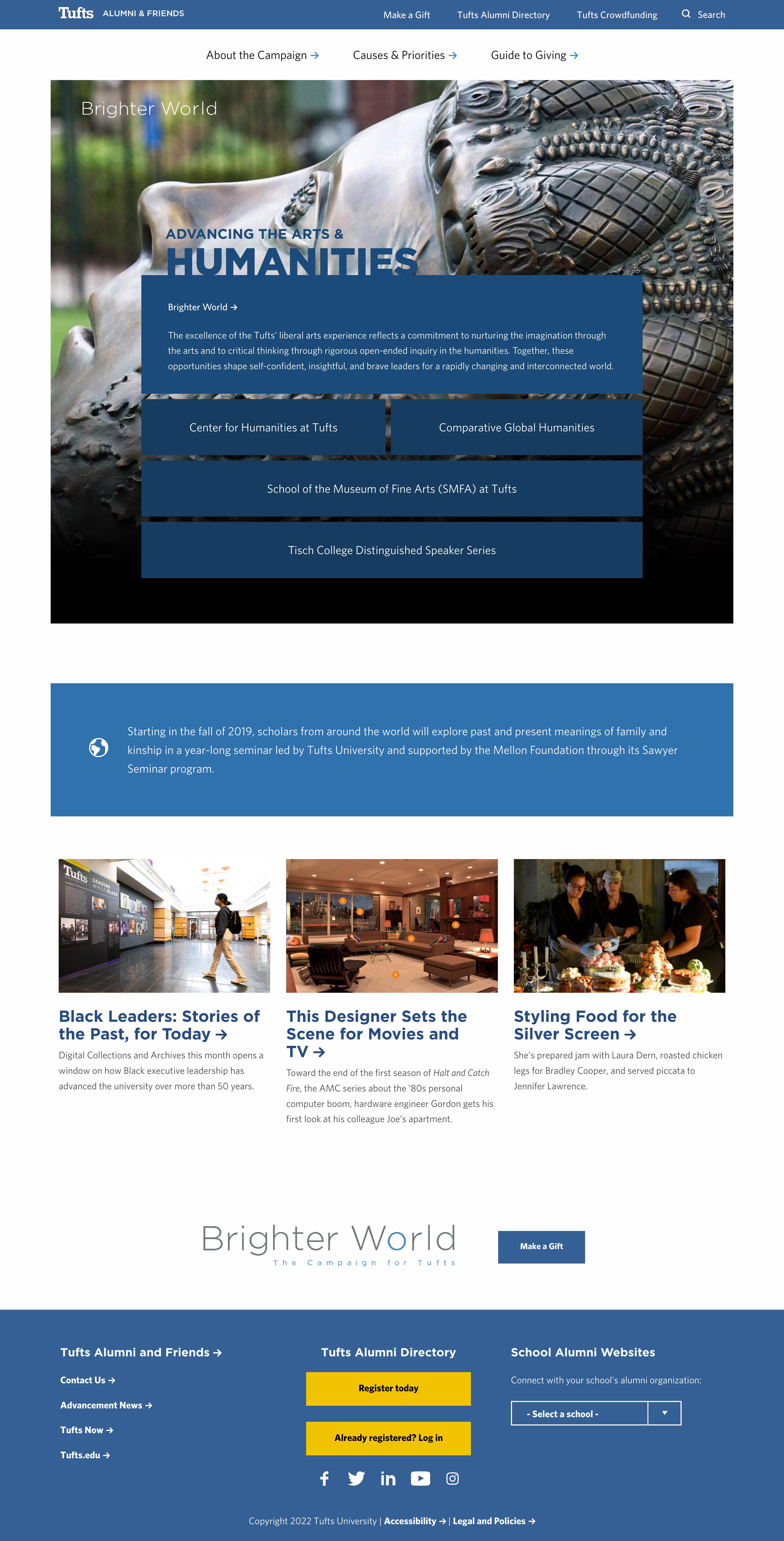
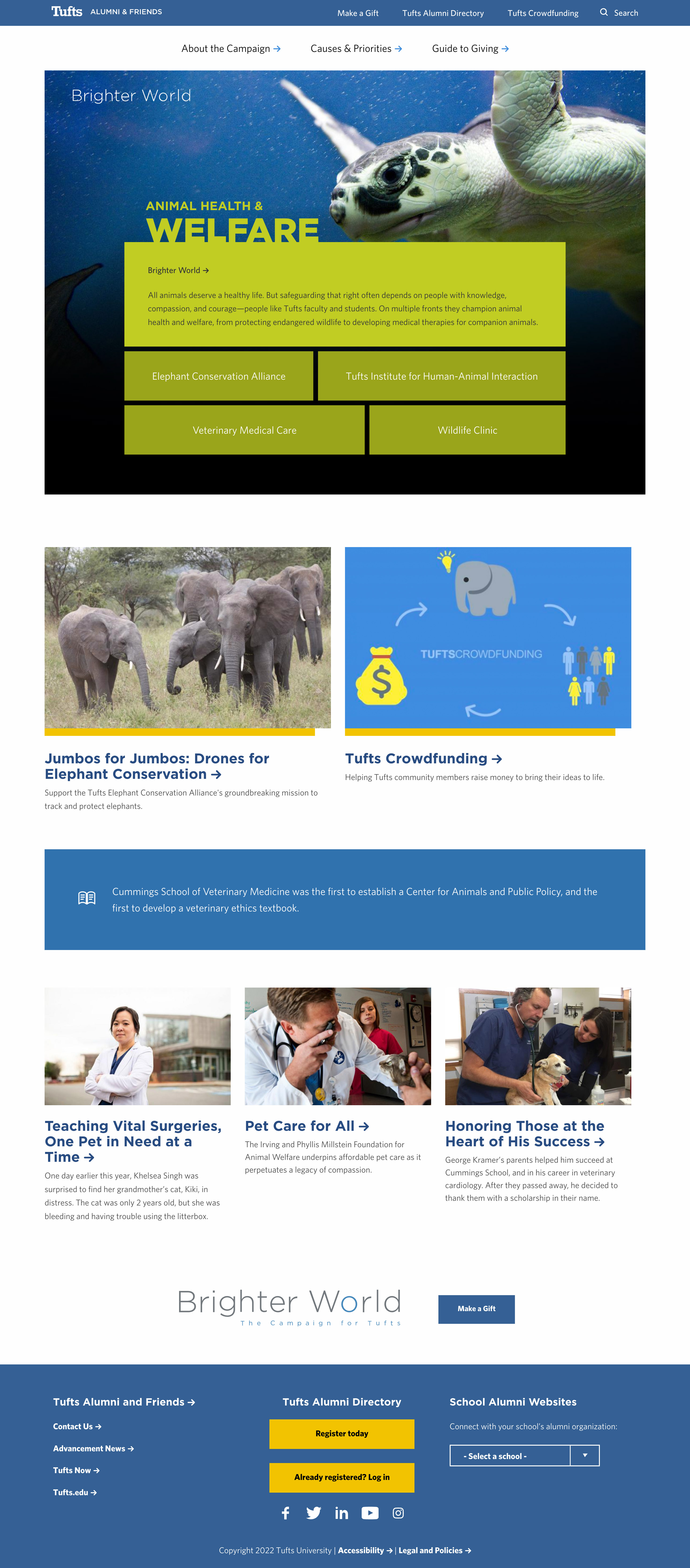
The mobile-first approach from the wireframing stage was reduced in order to accomodate elements from an existing site (the Tufts Alumni site) that the campaign site was folded into later in the project. We kept the visually distict feel, however, it was important to incorporate elements of the Alumni site to keep the experience intact. With the areas of focus established, I extended the grid pattern throughout the site to contrast brand colors with campaign photography.